牛市
Follow Topic
TOP1
Hot Topic List
Views
Discussions
Topic Background
Newest
Hottest
周大侠
币圈小白
Follow
Expand
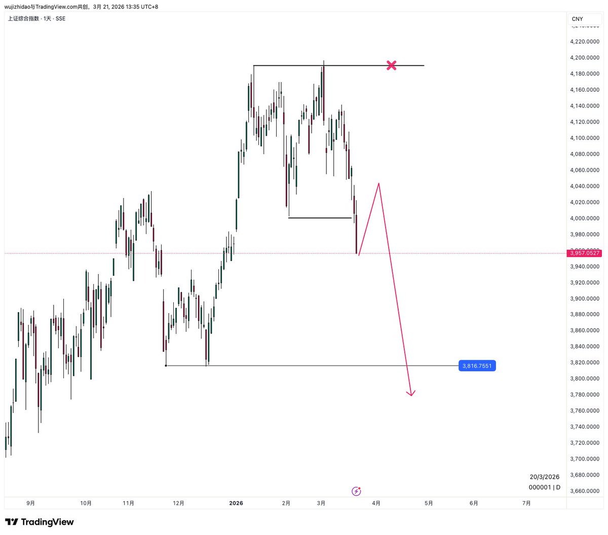
如果身边有炒A股了, 告诉他们,牛市结束了, 赶紧停止买入。
牛市
naiive
币圈小白
Follow
Expand
2026年,新买家将经历这轮牛市周期
牛市
Peter Schiff
币圈小白
Follow
Expand
黄金和白银价格近期出现技术性下跌。短期前景喜忧参半,但随着短期资金逐渐退出市场,长期牛市行情依然稳固。
牛市
WF
RWA
Follow
Expand
准备迎接历史上最强劲的石油牛市吧。
牛市
0xNobler
币圈小白
Follow
Expand
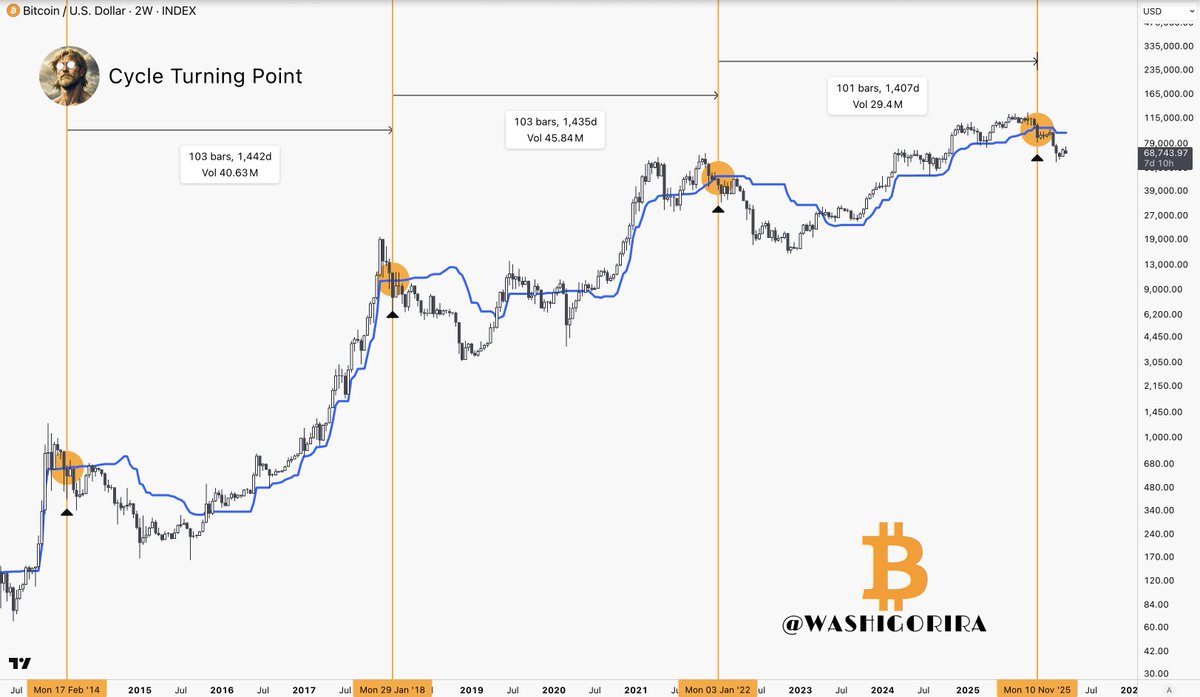
这张图表显示,我们才刚刚走出牛市陷阱的一半。 如果这种模式持续下去,比特币下周将跌至 48,000 美元。 真正的熊市甚至还没有开始。
比特币K线分析
牛市
比特币
BTC
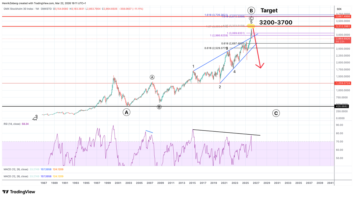
Henrik Zeberg
币圈小白
Follow
Expand
瑞典 OMX S30 指数见顶! 反弹——没错!但牛市行情已超过 90%。
牛市
Crypto Chuanzhang
币圈小白
Follow
Expand
激动的我以为牛市来了
牛市
BlockchainBaller
币圈小白
Follow
Expand
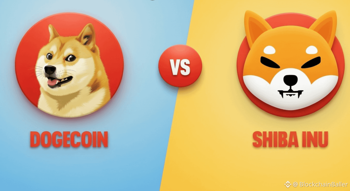
2021年牛市期间, $SHIB 涨幅高达111,468,947% $DOGE 涨幅高达38700% 哪两种山寨币在2026年牛市中涨幅最大?
牛市
DOGE
SHIB
Titan of Crypto
币圈小白
Follow
Expand
#比特币 当时我不相信比特币能持续牛市到2025年以后,结果被狠狠地嘲讽了一番。 市场走势往往取决于人们的感受,而不是大多数人的预期。
比特币K线分析
牛市
比特币
BTC
CryptoCat|猫姐🐈
币圈小白
Follow
Expand
刚跟朋友聊天,他是我每天都会交流行情的伙伴 总结下来对自己的能力区有自知之明很重要 一级基本挣钱的方法就 1️⃣PVP热点,需要反应快、手速快,不恋战,最好有低市值定价权 2️⃣埋伏,需要会判断后续预期(博弈点) 3️⃣龙头战法,大牛市最无敌的策略 4️⃣二段,二段是最需要技术的,最起码得会画线 我以前极度追求胜率(强迫症害死人😭)慢慢的得强迫自己改成:盈亏比第一
炒币心得
牛市