The current situation marks the end of the last bull market and the beginning of a bear market.
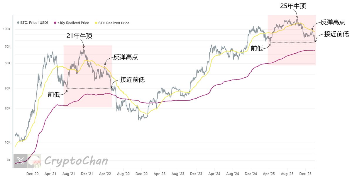
In the chart, the gray line represents the BTC price; the yellow line represents the average cost price for short-term BTC holders; and the magenta line represents the average cost price for long-term BTC holders (excluding those held for more than 10 years).
Indicator Introduction—
#BTC Short-Term Holder Average Cost Price Indicator: The average entry cost (price at the time of last transfer) for short-term holders (holding for <155 days). Reflects: the profit/loss status of the short-term group; when the price is higher than the average price, there is profit, making it easier to hold and rise; when it is lower, there is loss, making it easier to sell and form downward pressure or support levels, identifying the bottom of the short-to-medium term market.
#BTC Long-Term Holder Average Cost Price (excluding those held for >10 years) Indicator: The average entry cost for long-term holders (holding for >155 days, excluding those held for >10 years), focusing on active long-term holders and avoiding distortion from zombie coins. Reflects: the profit/loss status of the long-term group; when the price is higher than the average price, there is profit, making it easier to take profits and form upward resistance; when it is lower, there is loss, but it provides downward support, judging the bottom of the bear market or a cycle turning point.