


Think K-lines are just red and green bars? Wrong! They’re the "Morse Code" for crypto survival!
Newbies in the crypto world, have you ever faced this scenario—opening an exchange platform only to be mocked by flickering red and green candlesticks that feel like an alien language, while others’ "buy low, sell high" strategies seem like black magic? Don’t panic! Today, I’ll decode the "behavioral psychology" behind K-line charts, transforming you from a "chart-confused rookie" to a "chart-reading pro". Did you know? Data from 2023 shows that investors with basic K-line skills have a 3x higher profitability rate than total beginners. Buckle up—we’re about to translate complex K-line jargon into human language with real-life cases!
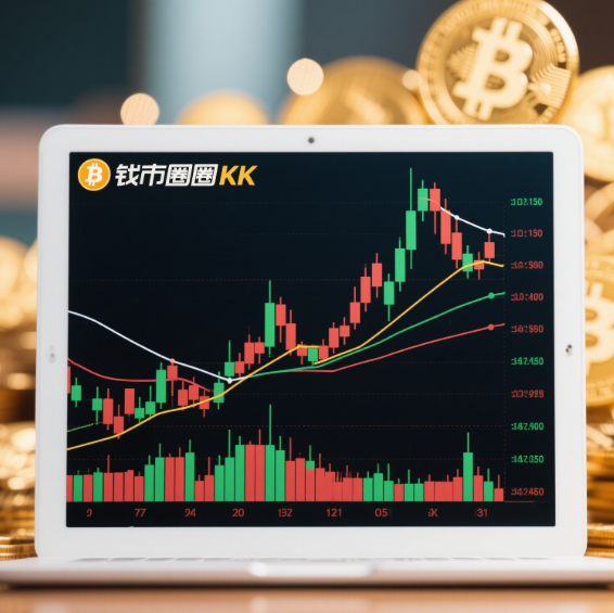
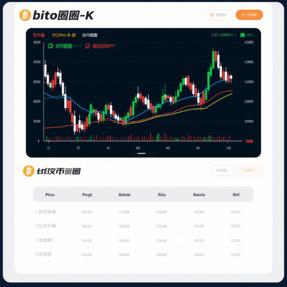
First of all, let's figure out what a K-line is. The K-line, also known as the candlestick chart, records the opening price, closing price, highest price, and lowest price of Bitcoin within a certain period. Each K-line is like a little soldier, standing there to convey market information to us. If the closing price is higher than the opening price, the K-line will appear as a bullish candlestick, usually in green or white, which means the market has been rising during this period, and the buying force has the upper hand. On the contrary, if the closing price is lower than the opening price, the K-line will be a bearish candlestick, typically in red or black, indicating that the market has been falling, and the selling force is stronger.
Next, let's take a look at the composition of the K-line. A complete K-line consists of two parts: the body and the shadows. The body reflects the price range between the opening and closing prices. The shadows are divided into the upper shadow and the lower shadow. The top of the upper shadow represents the highest price during this time frame, while the bottom of the lower shadow represents the lowest price. A long upper shadow indicates strong selling pressure above, meaning the buying side encountered resistance during the upward movement. A long lower shadow means there is strong support below, suggesting that the selling side faced resistance when pushing down the price.

In addition to single K-lines, we also need to learn how to read K-line combinations. There are many common K-line combinations, such as the Morning Star, the Evening Star, and the Dark Cloud Cover. The Morning Star usually appears at the end of a downtrend. It consists of three K-lines: the first is a bearish candlestick, the second is a doji, and the third is a bullish candlestick. It's like the dawn after a dark night, indicating that the market may reverse upward. The Evening Star, on the contrary, appears at the end of an uptrend and is a signal that the market may decline.
Moreover, moving averages are also great helpers for us to analyze the K-line chart. A moving average is a curve formed by averaging the Bitcoin prices over a certain period and connecting the average values at different times. Common moving averages include the 5-day moving average, the 10-day moving average, and the 20-day moving average. When the short-term moving average crosses above the long-term moving average, it forms a golden cross, which is usually a buying signal. When the short-term moving average crosses below the long-term moving average, it forms a death cross, which often indicates a selling signal.
Finally, I want to remind you that the K-line chart is just an analytical tool, and it cannot predict the market trend completely accurately. The cryptocurrency market is affected by many factors, such as policies and regulations, market sentiment, and technological innovation. Therefore, when investing in Bitcoin, we can't rely solely on the K-line chart. We also need to combine other information to make rational decisions.
I hope today's sharing can give you a clearer understanding of the K-line chart in the cryptocurrency market and help you avoid some detours on the path of cryptocurrency investment. I wish you all a bountiful harvest in the cryptocurrency market!


No comments yet